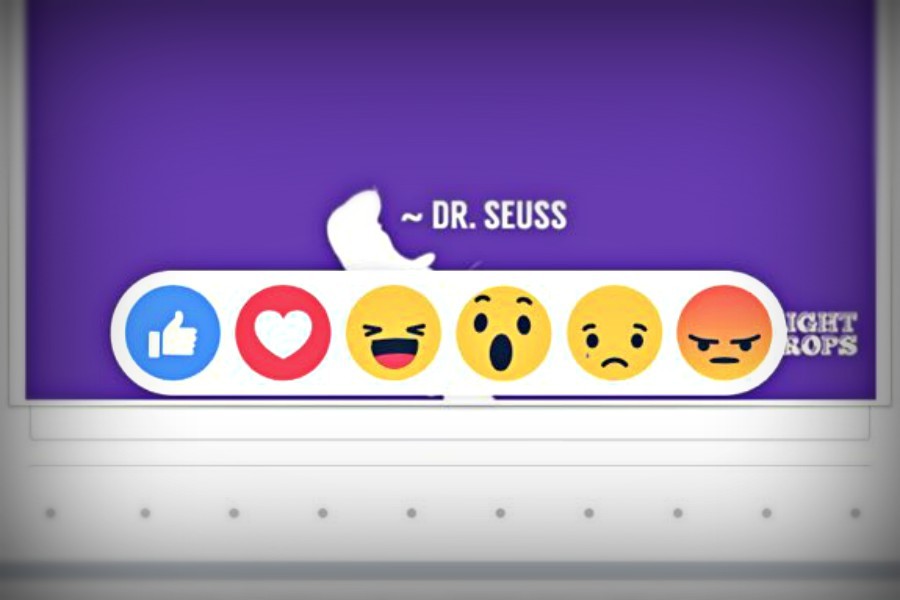
The emojicon take over!
Facebook expands “like” options to include emoticons
The new set of emoticons introduced last week by Facebook give users a wide variety of expressive options.
March 2, 2016
It is new, it’s fresh, and it’s stylish. There is a new look on everyone’s beloved Facebook, which boasted more than 1 billion daily users in December.
The social app has introduced a new like button to replace the regular “Like” icon.
Users now have the option to express some feeling with their “like.” The new reaction icon is located below the like button where you have a list of emoji’s to express love, shock, laughing, sadness, and anger towards a status.
It’s no doubt that people can get very emotional on Facebook. There’s a lot of people who could really use these emoji’s to just show how much they love their spouse or express their laughter because they found a Meme absolutely hilarious!
Are these icons actually useful? Or was it just a big time advancement for Mark Zuckerberg and his business to make a couple extra million bucks? These are questions for you to decide.
“I like it because now you can actually dislike something,” said junior Makayla Carles.
“The original like button is a classic, but it’s always nice to see things changed up to keep it interesting. I really like how I can express myself in a simple like button,” said Jarrett Taneyhill, “I think it’s a timeless thing that even our grand kids will use.”
It’s quite clear to see that many people are all about this new feature. Some posts have over 100,000 emoji reactions used.
But not everybody is happy.
“I think it’s stupid,” said junior Paige Wilt. “It just takes too much time.”
“It’s too much of a hassle to like or dislike something. I’m more of a classic like button person. The new system is somewhat complicated so I prefer the original version,” said senior Caroline Showalter.
It is totally up to the user’s preference to decide if these icons are irrelevant or useful. It is something we see all the time with updates on the server. This could be one of many changes coming to the site, so keep your eyes peeled to see what changes are coming your way.


